Tuesday, November 30, 2010

The Evolution of Sebatian's World (Last Reflective Essay)

I felt inspired by this book project because I have always had a slight draw towards writing something geared towards children.  I had never really had a solid idea on where to go with that, until this assignment.  When we originally did the typography project and I used the mold of my cat with a J used as his tail, I had no idea it would become what it has become. I went way above and beyond the requirements for this project and I am actually considering submitting it for publication on a large scale.

I began with just a rough idea of making the cat the main character of this book.  Over the process of putting this book together it has evolved on many levels for the final draft.  I wanted to keep it on a base level for young children and give it great color and simple text. I am actually quite proud of what it has become.  I had it done the Sunday after the brake per the original deadline.  I actually think if I had not been pressed I would have done a little more over view with it, even though I am happy with the finalized project.  I printed it out myself for the final paste up, the ink was rather costly and my stapler wouldn’t work so I ended up stitching the binding together by hand with a needle and thread.  I am happy with the final product and in the end grateful for the pressure to finish it.

My children have all seen the final product as have many friends of mine.  I am getting extremely positive feedback and even emotional reactions from my eight year old daughter.  What am I going to do with this book? Well I suppose I could just set it aside and be proud of it as a great project in a class room, or I could actually look into getting it published as a true finished product and seeing if it is marketable.  I never thought I would say something like that, but at this point what do I have to lose?

There would be quite a bit more to it as a completed work of art, or a finalized book.  All the textured areas that I created with the filters in Photoshop would actually have texture in the book of some sort to give not only the picture stimulation but the added effect of hands on stimulation.  I am pretty sure I would tweak some of the text and would be open to constructive criticism to make it an even better and more marketable project.  I have left it open for character development and left a bit of a mystery open in some parts to make a next installment or future books desired and looked forward to for both readers and myself for the creativity of it.  Even if it goes no where I truly want to get this book printed out in a hardback, with a glossy front and back cover and texture where it is implemented with the filters. There would be no disappointment in that even if it is only for me and my kids to appreciate and hand down.


This class has been a positive experience for me.  I have learned a lot and it has opened up other avenues of creativity and media expression that I hadn’t pushed myself to go towards until now.  I am very proud of this final project.

Sunday, November 28, 2010

Final Book Project (From Front Cover to Back)

I think it could still use some tweaking in a few places, maybe some text issues or wording but here is my mostly final draft for the Final Book Project.  I present:

Sebastian's World


Friday, November 12, 2010

Book Start: Sebastian's World

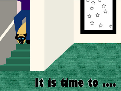
I am doing most of my project in Photoshop, when i am done with all the graphics i will transfer it into InDesign for a final project.  I am going to be putting these from top to bottom as it would be flipping through the pages.  I still have a ways to go and this is going end up being more than the eight pages. 
Book Cover

Dedication Page (to my children)

Page 1

Page 2

Page 3
back-cover

Sunday, November 7, 2010

Big Project Proposal

Books are a important part of our children's lives.  It is important to get children interested in books at an early age to inspire reading and education.  I am proposing a children's book directed at the ages of between 3 and 5 years.  I am looking at using the dimensions of a standard landscape of approximately 10X8.  The landscape pages give a long and broad view of images to catch children's attention and even make the image itself as long as two pages with the text being a part of both.

This project will have limited and bold text to portray clever terms for the main character of the story.  I have already created one piece of art for this project which is where i am drawing the idea from.  It was originally from one of the typography projects i worked on.  I have actually thought about this idea before i created this image because i think that pets are a huge interest for kids and i can make what already truly exists as a real to life pet into an animated version of himself.  He can be more bold, eye catching and imaginary in book form with perhaps several adventures and a lesson to be learned at the end.  Here is the original project i will be drawing from:

I am currently working on some sketch ideas on this and some title ideas.  I have even played with the idea that this will be the cover of the book, with the title integrated into it in some fashion.

The pages will be bold, full colored and i also like the idea of a texture added into the book and the pages in a few areas to be able to be touched or felt by the childs touch.

As i piece this project together i will be focusing on humor and simplicity as well as artistic favor to capture attention of young children. 

Sunday, October 31, 2010

Reflective Essay Poster Project

I wanted to do these with a propaganda theme, or political theme towards some of the issues that have been going on in our country lately.  I used curves in this one a little more to get different effects on layers for contrast between the colors that were similar.  I stuck very closely with the limited pallet idea because i wanted them to be clear, simple and clean to portray the message in both not only with the words chosen but also with the images. 

The main points in both are definitely centered in text, and while that isn't always necessarily the best way to go about it i wanted the one word in both to be the grabbing text that then lead your eye to the rest of the poster to visually interpret the message. 

I created them both with the idea of making people think about the key issues that are being addressed in both.  The looming creature signifying the greed and obscene wealth of corporate America's capitalistic world, versus the shadowed figures of everyone else just trying to survive.  I thought about going further with wording in "Capitalism" but felt that it would have actually taken away from the poster, not have added to it. 

For the other propaganda, FAIL, i chose this word as it is a rather famous word used all over the Internet these days.  It has taken on it's own pop cultural icon and is simplistic enough to convey the point i was trying to make about the problems in our government today because of all the bickering being done between the main parties rather than focusing on the large issues and working together to help this country.

I do think that i misunderstood the assignment at some point, because i thought we were allowed to chose both of these to be any we wanted such as music, propaganda, or movie.  I had already put a lot of time into them both and was not able to work on another at the point where I noticed that it says two out of the three themes.  Either way, it was challenging in several spots and also a passionate project for me because of the subject matter i used. 

Poster Project 2

Poster Project 1


Sunday, October 24, 2010

Photo Project Reflective Essay

I learned a lot from both of these projects, however more so for the Alphabet Soup part of the project.  It was challenging to view nature in a way to find letters around me and then actually trying to get them to stand out using Photoshop had me utilizing many more of the features.  I felt a little frustrated during a few of the pictures and the H picture i did is probably what i would consider the worst of them all.  I had a hard time attempting to get the H to stand out in the photograph and ended up using the clone stamp tool to attempt to clear out the negative space rather than highlighting the H form itself.  It has the appearance still of being played with more than i would like it too, i need more practice using that tool.

The "other" project, or stranger project, ended up being a fellow classmate.  I wasn't sure if that falls under direct stranger, but i do not know her very well and only know her from being in class with her.  I find her different or unique from me in her creation with clay and her physical appearance.  I did ask her permission as i do not feel that taking a personal picture of someone with out permission would be fair, it could offend someone and i did not want to do that.  I wouldn't call it a set up picture because i just wanted to capture her doing her artwork naturally, rather than at some particular time.  I am not sure if that is really a candid shot either, but i think it turned out rather well and not only did it capture her but also the feel of the ceramics room also. 

My favorite photographic letter form is by far the X.  I actually just stumbled upon it while walking to class and i used the natural light that morning.  I did change the brightness down to a little darker and the color levels to give it a more red feel to compliment the beautiful leaves hanging right above it.  I also lightend up the roots themselves to help them stand out a little bit more. It is in my opinion the most pleasing to the eye of my"Alphabet Soup" collection. 

Saturday, October 23, 2010

Photo Projects

Self
Friend(Daughter)

Fellow Student

X in Nature
V In Nature
T In Nature
H In Nature
O In Nature

Sunday, October 17, 2010

Reflective Essay Type

Working with type face can be difficult, it feels a little limiting with your creativity so i wanted to try and make visually striking images with the type integrated somehow into something other than just one letter. I have found after this that it didn't limit my creativity at all it actually challenged it and made for some really cool images.

I experimented with several different types and used a different typeface for each project.  The challenge in that for me is that I am working with Photoshop 7, and it doesn't show you the actual look of the font as you are going through them to find one that you like, the advantage is that i have a font package with it and many options to choose from.  One thing i find with type face is that it is also easy to forget what you were working with so reminders are necessary sometimes so you don't have to go back through hundreds of them to find what you liked.  I looked for ones specifically that made me think of other forms or figures to utilize them for the way i wanted to approach this project.

I did not choose the letters randomly.  They are my own personal initials and the first initials of my kids.  I thought about sticking to specific interests they might have involving their letters personally, but since my oldest child and I have the same first initial that didn't quite work the way i wanted it to.  Instead i stuck to my original plan of finding type face and fonts that sparked my imagination for creative images to work on and challenge myself with.

I rasterize in several of my projects, especially the B project so that i could apply the filters i wanted to get a specific effect on them.  It was necessary, in the B project specifically, to get the fabric feel to the entire project i was looking for.  The idea was to give it a feel as if to be on a quilt or a child's bed spread and i had to rasterize the fonts to do so.

My personal favorite is the J. J is my sons first initial and i actually struggled with how i was going to work with it for awhile.  After finding that specific type face it reminded me of the tail of a monkey or other animal and then it became a flat colored version of our cat.  As the rest of it came together it was simple, fun and i enjoy seeing it in several different sizes.  It is hard to pick a favorite because i enjoyed all of them, but visually the J project is my favorite.  I would like to add that sometimes if you want to really get a feel for what you like best, the thing to do is walk away and come back to it later, that allowed me to pick a favorite for this assignment. 

A project

J Project

Saturday, October 9, 2010

Project 2: (Reflective Essay)

My original idea was as a simple thought process to do something unique.  I did not want to copy an idea or existing character.  I picked colors from Photoshop itself to work with rather than sampling from other things.  Since it was a made up idea i didn't think there was any reason to sample any other colors.  I had the idea of a teal and purple in my head for a fairy so i decided to go with it. 

I started with the base colors, matching them up with a darker version for arms and head then i began adding detail after.  Once i got the color scheme where i wanted it i started with the face and grew from there.  I didn't start out with a story for her, but i play a game called fairyland on Facebook, and rather decided she would be my character from that game as i went on. 

The biggest challenge for me with this, was how to get wings.  I wasn't sure if i wanted to go that route but what is a fairy with out wings? So i had to figure out how to add them into this template.  Using the shape tool i was able to manipulate a shape to get them to work.  I added the tabs from one of the arms and the slots on her back for them to go in.  This was an incredibly fun project and i enjoyed adding all the details to her as i went along.  From her shoes to her skirt, i feel she is a completed work that i can't wait to cut out and see in a real life version. 

Saturday, October 2, 2010

The Beginning (Scratch Reflective Essay)

I have been playing with Photoshop off and on for the last eight years.  I truly believe it is not necessarily possible to ever learn everything about Photoshop.  It is such a diverse program with so many options the endless possibilities that it provides are limitless.  I have been out of circulation with it for some time while catching up on science classes and other prerequisites for my degree.  I am excited about this class and was excited about this assignment.  I love the freedom we have been given to explore our creativity and play with the possibilities.  I finally got to play with a drawing pad, and i think i will be finding a way to purchase one for my own home.  I would consider myself an average user of the program, not a beginner or an expert, however i have been an artist all of my life.  These first three projects were challenging and fun all at the same time and a great challenge to remember how to do the things i wanted to make it do.

Since were were given free range of creativity with just a few guidelines i didn't allow myself to have any solid idea in my mind.  Over the years i have found that when you allow projects like this to become themselves with out a real plan, you often end up with some of the best stuff.  With the first project i did, the flat project, i originally just wanted to play with some of the ovals and colors to see where it went.  It eventually started to look like a painters pallet and rather became from there.  With the second project we were limited by only several colors, the only idea i had in my head was to keep it clean and simple.  Simple is often under-rated in creative projects, but it is true that sometimes less is more.  I like to use words in my projects, not all of them but somehow it personalizes them and gives a little addition to it.  For the second project i used part of the lyrics from a song that i love, i didn't begin with that in mind but after viewing it when it was "finished" it felt exactly like the words i left on the project. For the third project the instruction that stuck out in my mind the most was to "imagine paper cut outs".  It led me to a more child like frame of mind and i began with just a solid black background and added a filter that gave it the asphalt appearance, i put in the yellow lines for the feel of a road and after staring at it for awhile the tortoise and hare started to become.

I used many layers in these processes, it is probably one of the best features of Photoshop.  It gives you so much freedom to move, adjust and fit anything you create where you want it.  I look forward to playing more with these projects, learning more and blending together more of my ideas into even better final projects.  I would like to learn more about masks and more tricks on making things come together and possibly be easier to put together.  I can't wait to continue this blog and work through more challenges as we go along.

Clear Shapes Image for Scratch Assignment